
Bookstore
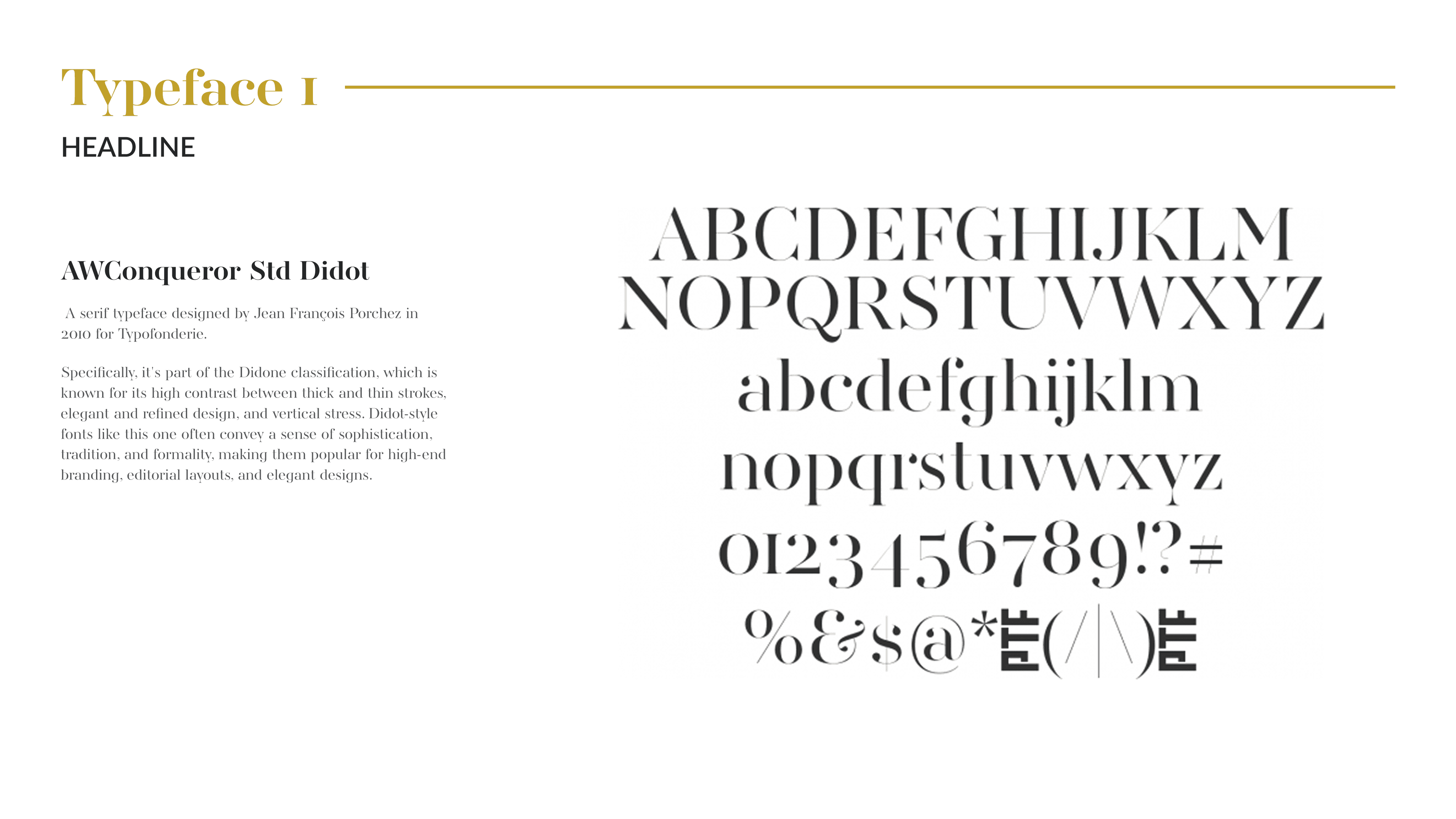
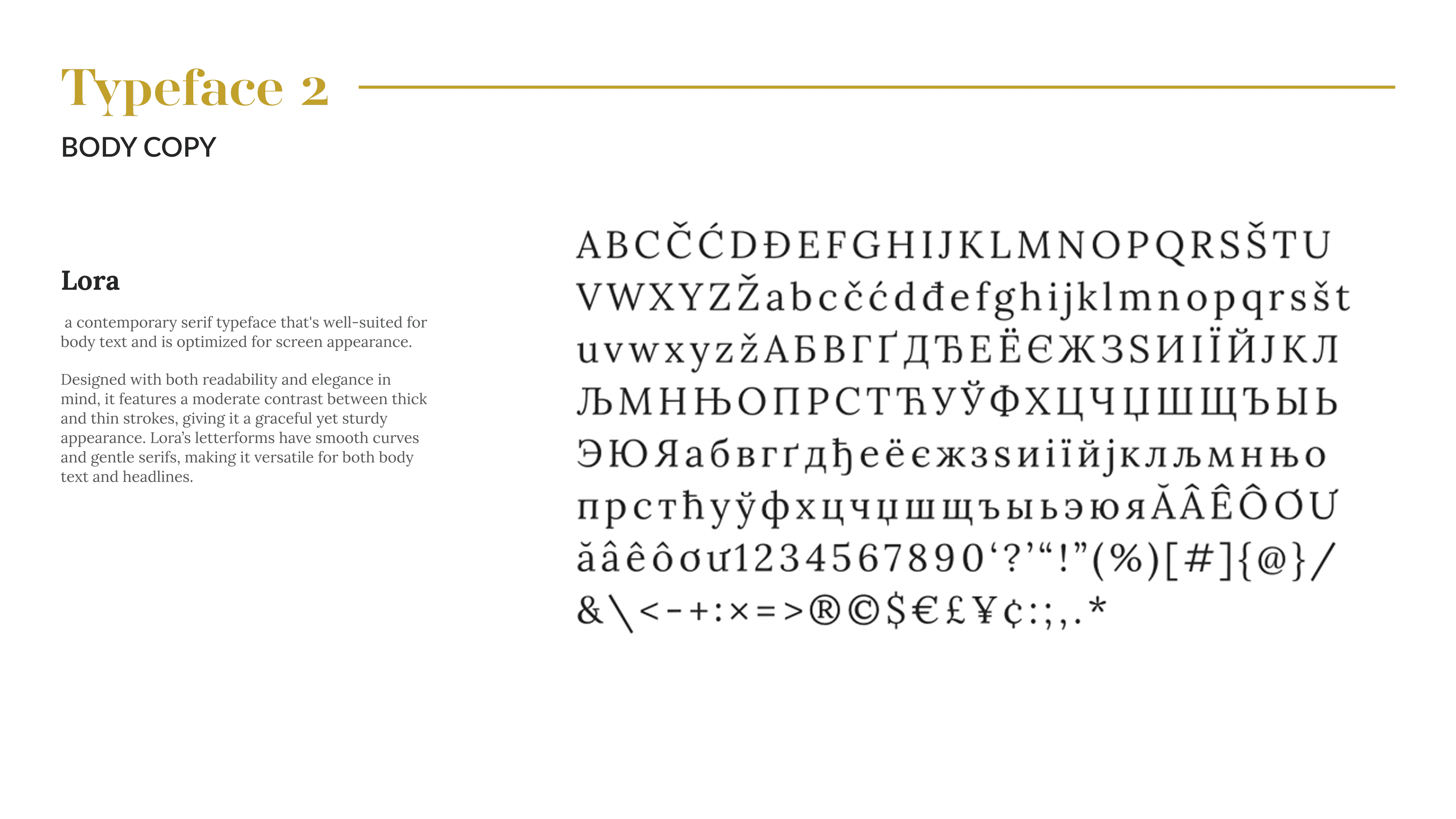
Art Direction
UX/UI
Barnes & Nobles
Summary
Barnes & Noble is a classic bookstore for readers of all kinds. This UX/UI redesign makes the experience cleaner, friendlier, and easier to browse, helping readers discover books with less effort and more enjoyment.
Problem
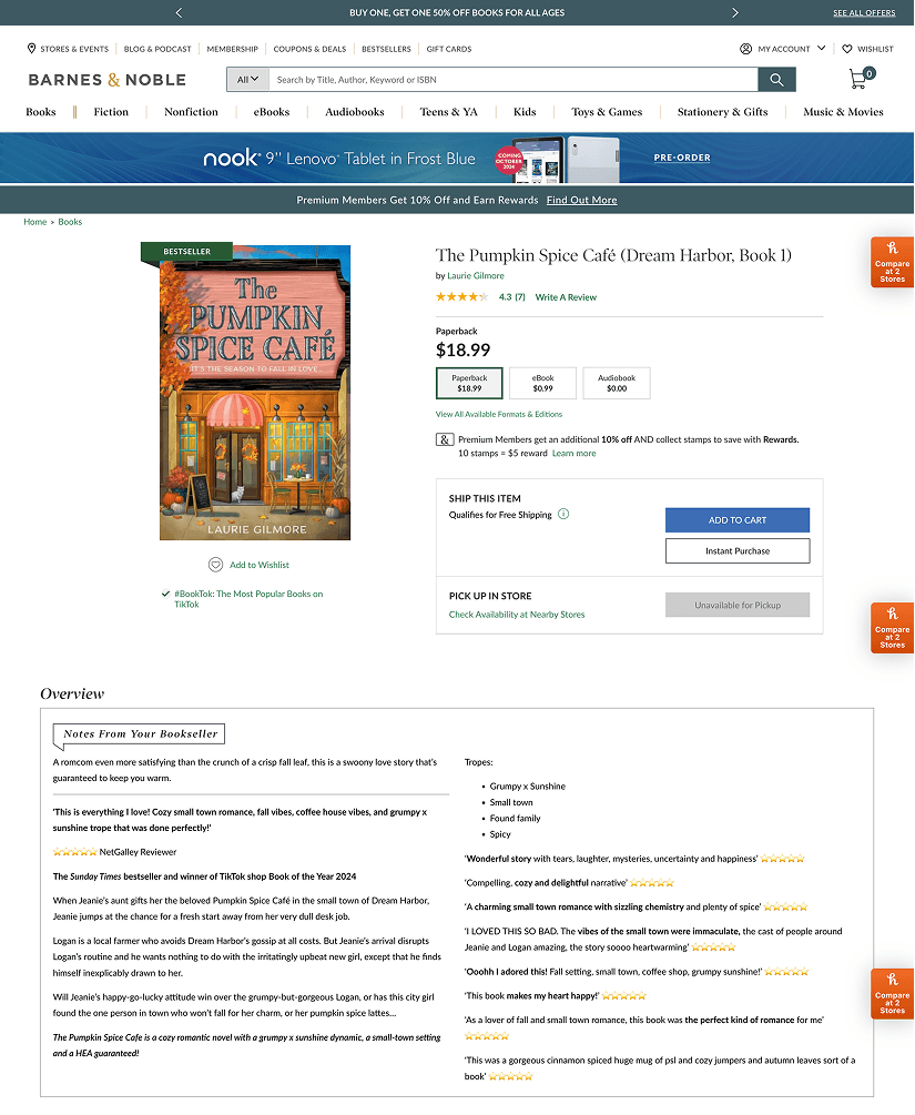
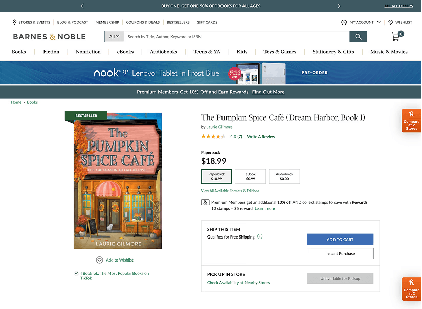
Solution
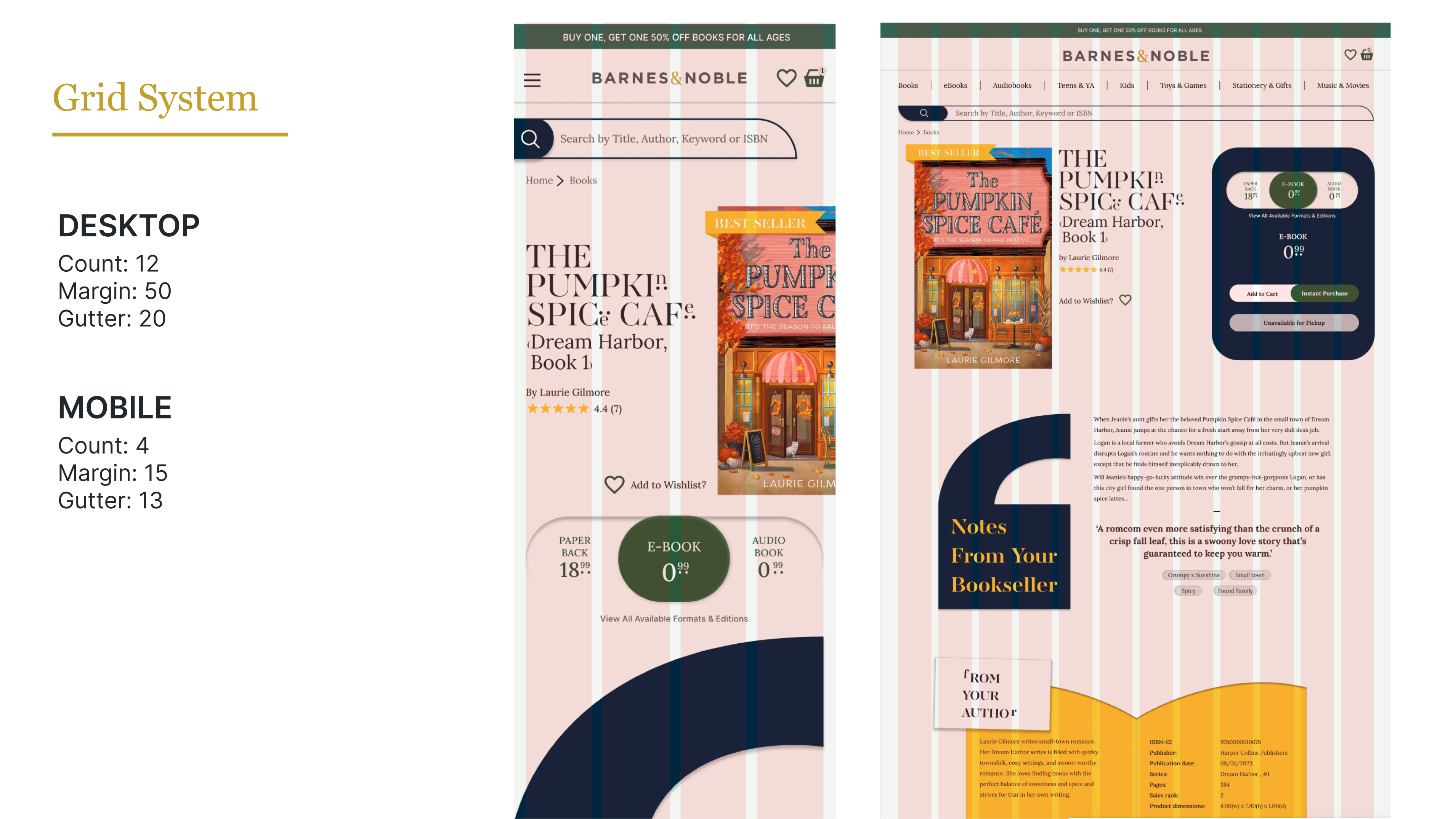
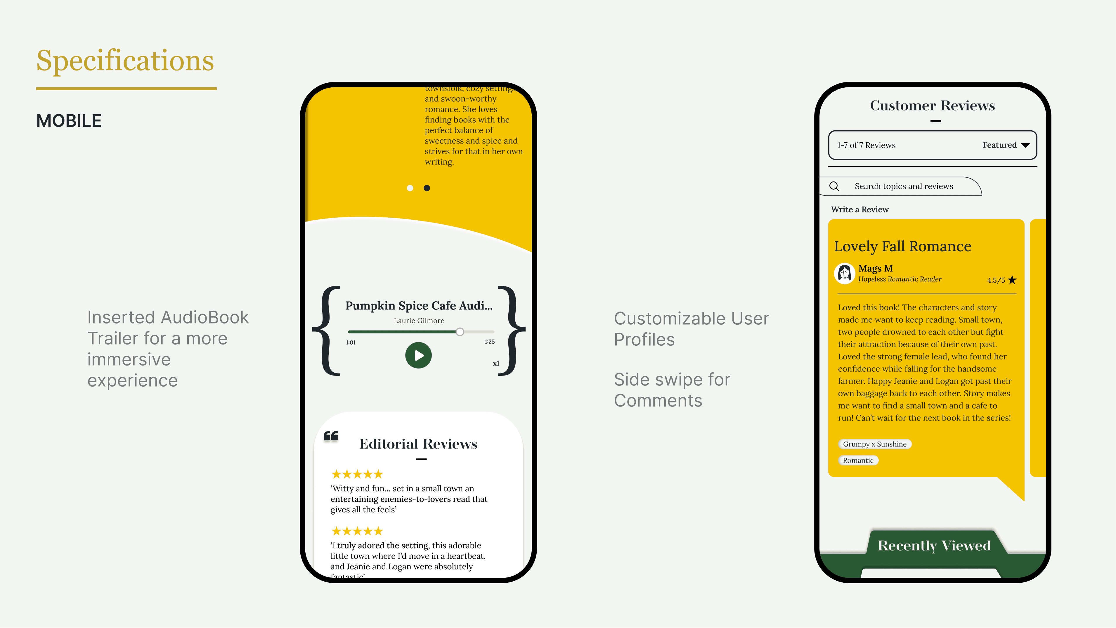
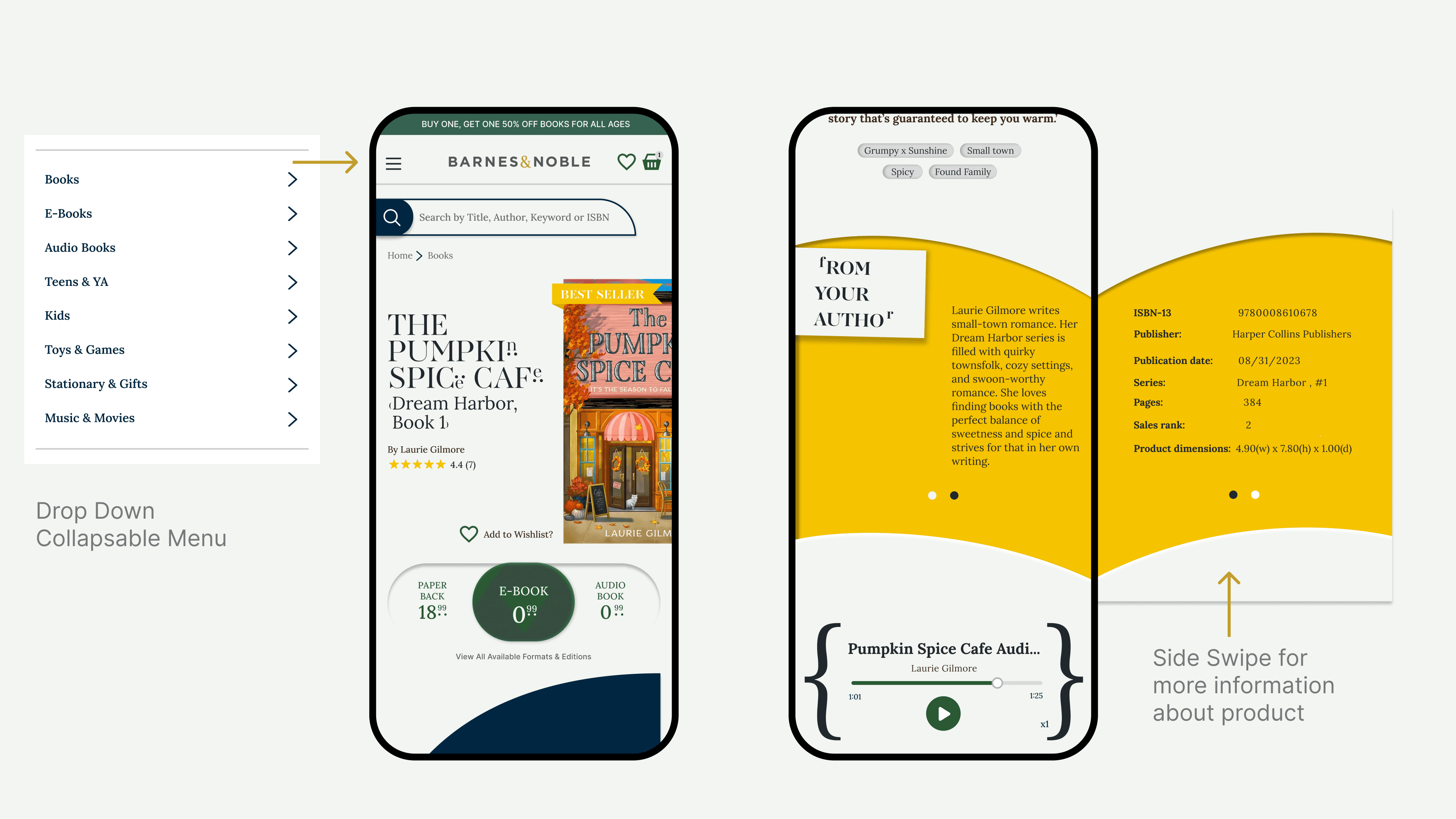
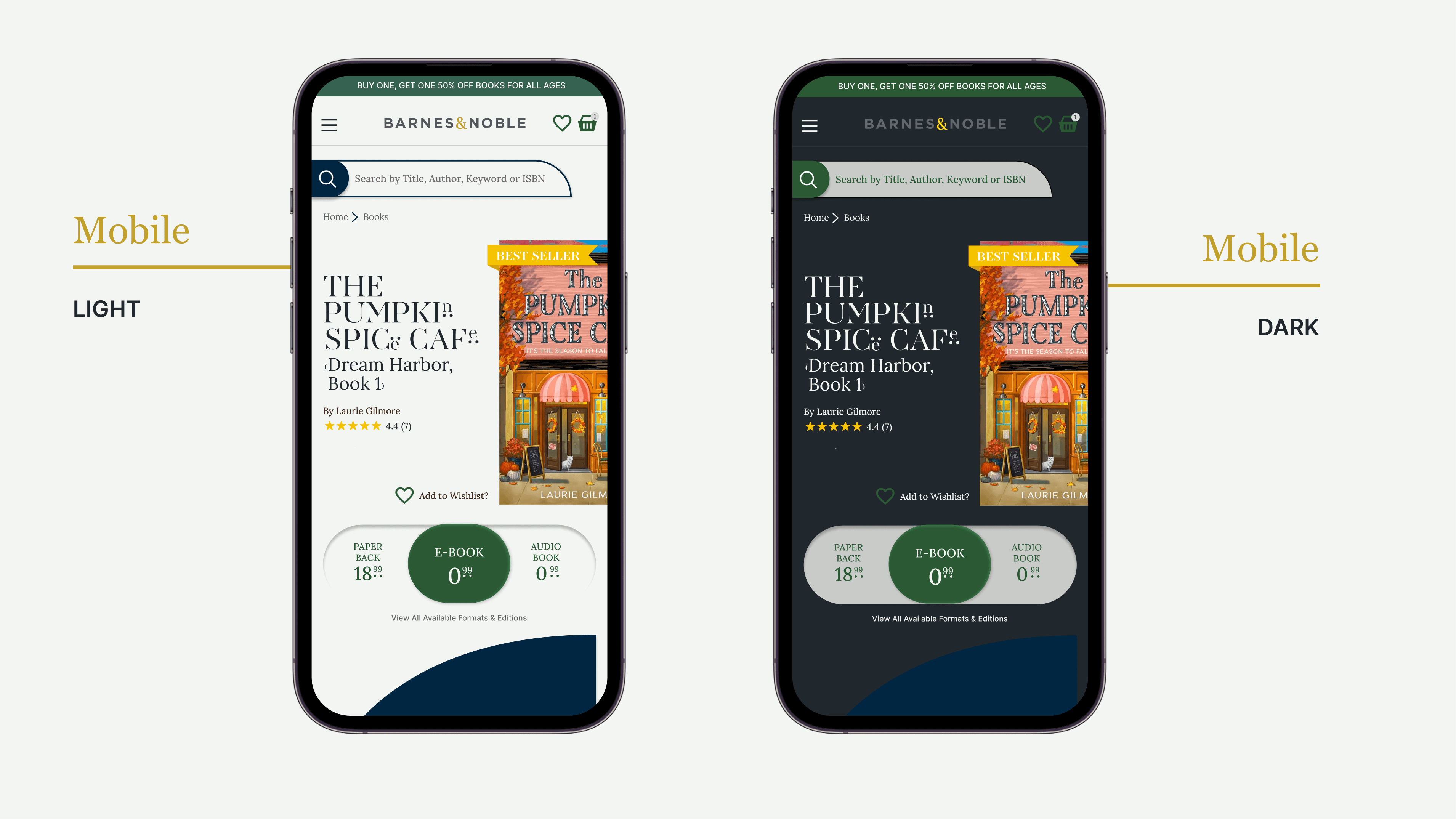
The newly developed Barnes & Noble product website features a clean yet playful design that enhances the user experience. It feels approachable and trustworthy, encouraging users to explore and purchase books with confidence in a welcoming, relatable environment.